ds12 ds13 ds14 ds15 ds16
1 850 740 900 1070 930
2 850 950 980 980 880
3 1000 980 930 650 760
Lecture 8: Plotting
August 22, 2026
๐ Last lecture we studied the following topics:
.txt;.csv; and.xlsx.๐ Today we will continue looking at describing and visualizing external data, specifically:
.csv FilesFile Types Recap
Last lecture we looked at several different file types that data can be stored as, including:
.txt files.csv files.xlsx filesWhy .csv?
In this course we shall be using .csv files almost exclusively, and so we typically will only need the read.csv() function to load real world data.
Loading Michelson.csv
The Michelson data is a famous dataset measuring the speed of light. I keep my data in a data subfolder, hence the path name below.
The Reality of Real Data
Real data is rarely clean and well behaved. It is often messy and unintuitive, and it is our job as data scientists and statisticians to understand, interpret and draw meaning from the mess.
Key Tools
To accomplish this goal we begin with several key tools:
Population & Sample
Data consists of information from observations, counts, measurements or responses.
Parameters & Statistics
Summary statistics are the key statistics of a sample that we always generate to get an idea about the shape and location of the data.
Key Statistics
02:00
The summary() function provides the first 6 statistics. The correlation and standard deviation are given by the cor() and sd() functions respectively.
Michelson object to a tibble using the function tibble().ds16 using the select() function and apply the function summary().Michelson to a tibble using tibble().ds16 column using select().summary() to obtain the key summary statistics.Descriptive statistics help to summarize key characteristics of the data such as:
๐ In this course we only consider location and spread.
Measures of Centrality
mean()median()mode()Measures of Spread
range()var() and sd()Sample Mean
The sample mean is just the arithmetic average. For a sample \((x_1, ..., x_n)\) the sample mean \(\bar{x}\) is given by
\[ \bar{x} = \frac{1}{n}\sum_{i=1}^nx_i=\frac{x_1 +x_2 + \cdots + x_n}{n} \]
๐ This is only an estimate of the (true) population mean, which we denote \(\mu\).
Sample Standard Deviation
The sample standard deviation \(s\) is:
\[ s = \sqrt{\frac{1}{n-1}\sum_{i=1}^n(x_i-\bar{x})^2} \]
๐ This estimates the (true) population standard deviation \(\sigma\) (recall \(\sigma^2\) is the variance).
๐ Relation measures describe how two variables change together โ i.e. how does one variable change if we change the value of another?
Intuition

Covariance
The covariance between two variables \(x:= (x_1, ..., x_n)\) and \(y:= (y_1, ..., y_n)\) is given by
\[ \text{Cov}(x,y)=\frac{1}{n-1}\sum_{i=1}^n (x_i - \bar{x})(y_i-\bar{y}) \]
๐ The covariance can be negative, which indicates a negative linear relationship (one goes up means the other goes down).
Correlation
From the definition of covariance we naturally define correlation, denoted by the Greek letter rho \(\rho\), of two variables \(x\) and \(y\) as
\[ \rho_{XY} = \frac{\text{Cov}(x,y)}{s_x \cdot s_y} \]
We can compute the correlation between two vectors in R using the function cor().
05:00
We shall be considering the faithful.csv dataset, which contains a list of waiting times between eruptions and the duration of eruptions for the Old Faithful geyser in Yellowstone National Park.
faithful. Convert this to a tibble() object.mean() and sd(), compute the mean of eruptions and the standard deviation of waiting.cov() and cor() to compute both the covariance and the correlation between eruptions and waiting.faithful.csv and convert it to a tibble.eruptions and the standard deviation of waiting using mean() and sd().eruptions and waiting using cov() and cor().[1] 3.487783
[1] 13.59497
[1] 13.97781
[1] 0.9008112
The Problem
It is very important to practice caution when using summary and descriptive statistics. They are very simplistic and are easily fooled by more complex data patterns.
Example Data
To demonstrate some of the problems you may run into we consider problem.csv, which can be found on Canvas.
Applying summary() to problem we obtain the following summary statistics:
x y a b
Min. : 0.00 Min. : 41.0 Min. : 1.00 Min. :0.000
1st Qu.: 2.25 1st Qu.: 49.0 1st Qu.:12.25 1st Qu.:2.505
Median : 46.50 Median : 50.5 Median :21.50 Median :3.068
Mean : 48.87 Mean : 405.3 Mean :22.37 Mean :2.855
3rd Qu.: 97.75 3rd Qu.: 53.0 3rd Qu.:32.75 3rd Qu.:3.489
Max. :100.00 Max. :16368.0 Max. :44.00 Max. :3.784
We might make the following quick observations:
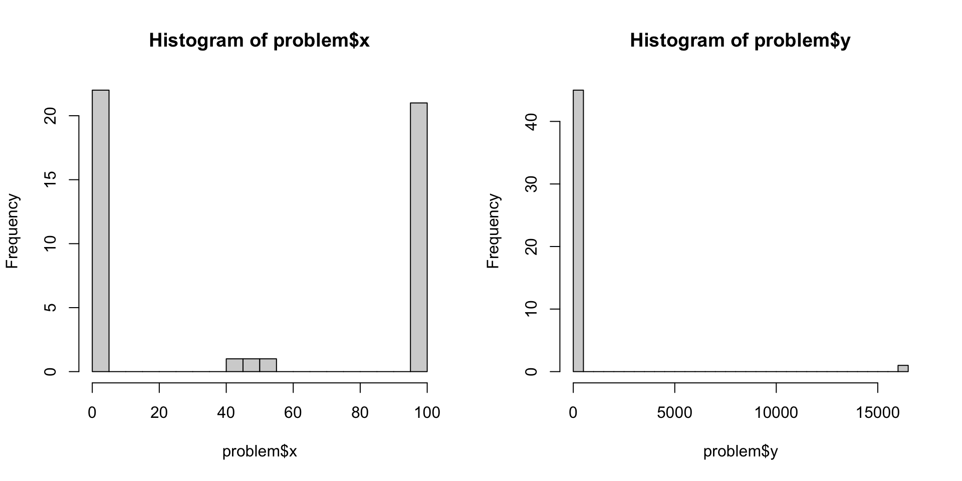
x is clustered around 48.y is clustered around 405.A closer look at x and y:
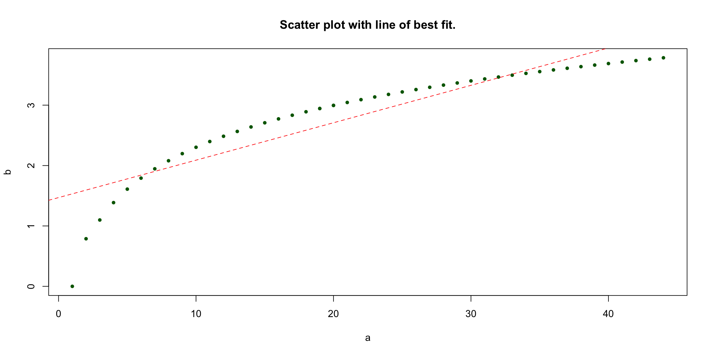
The relationship between a and b does not appear to be linear!
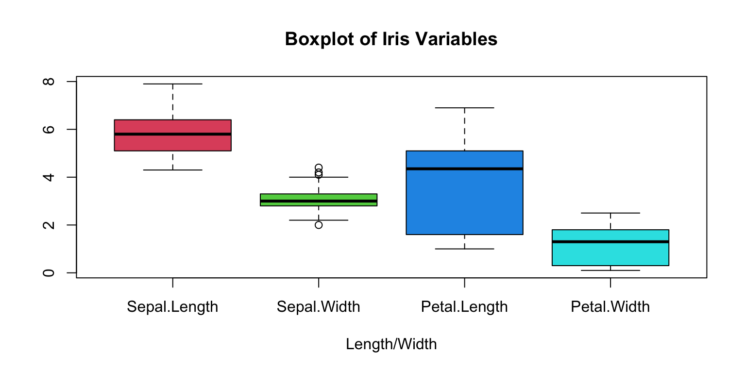
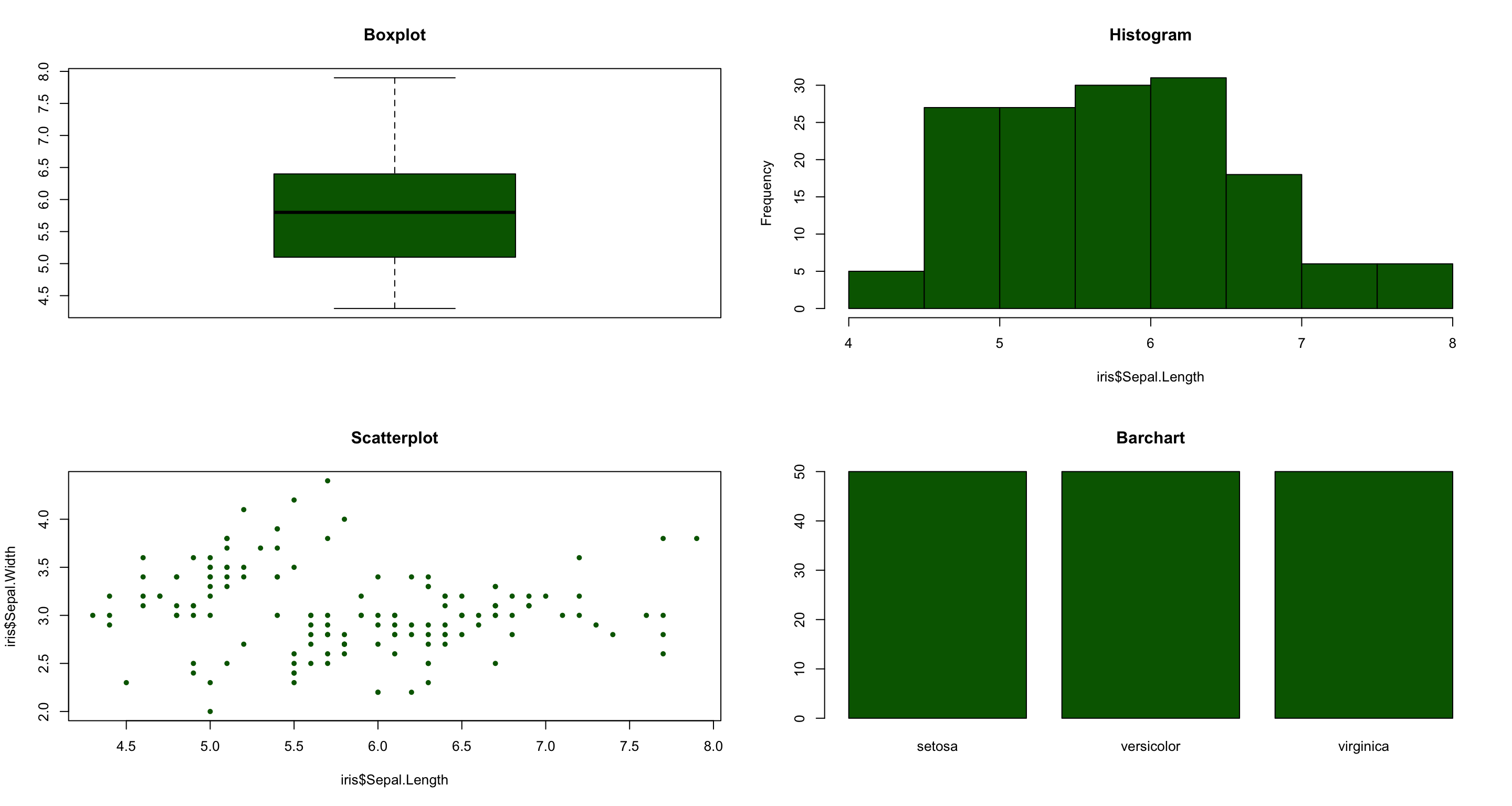
There are a wide variety of plots which all have their uses for data visualization and interpretation, including:

Example Data
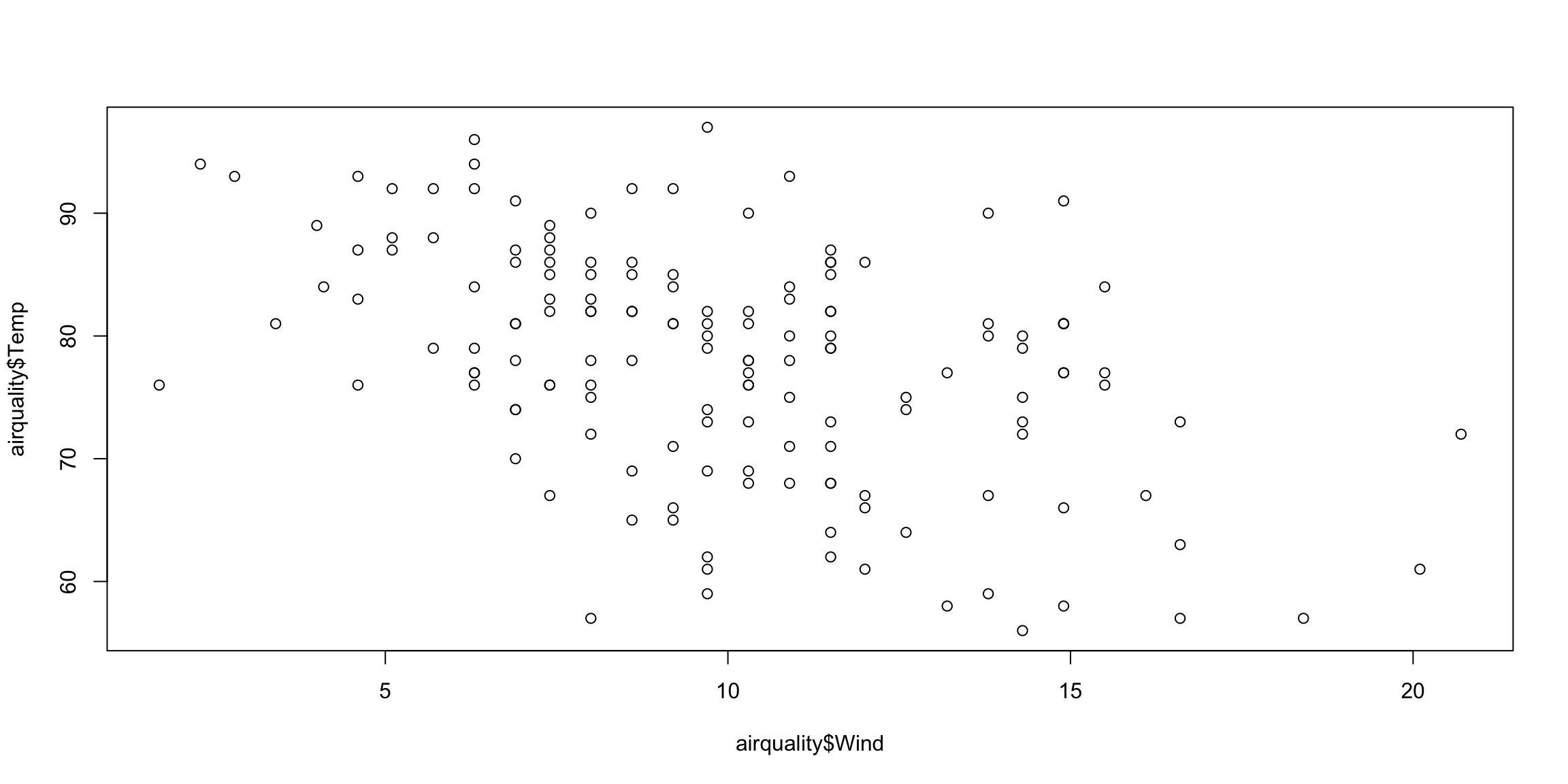
For an example we consider the airquality data in the datasets library.
This is fine but not very professional. Fortunately, plot() has a lot of arguments we can use to tune our plot.
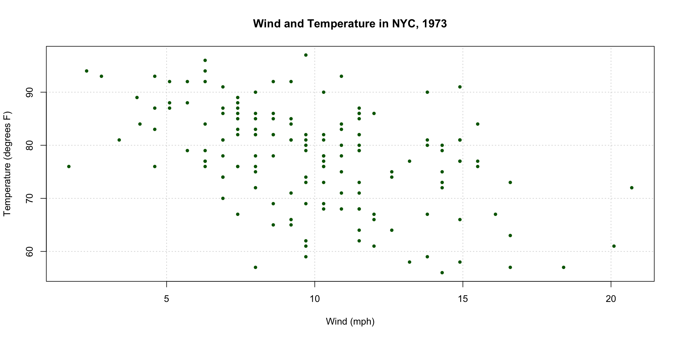
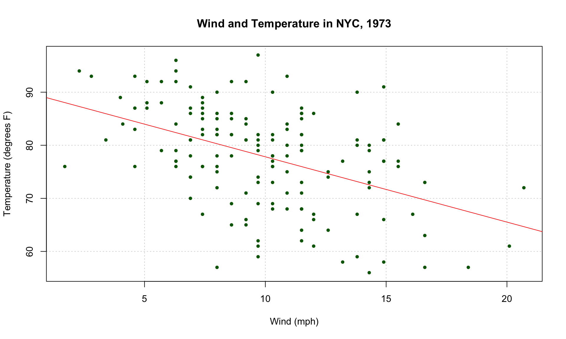
What We Changed
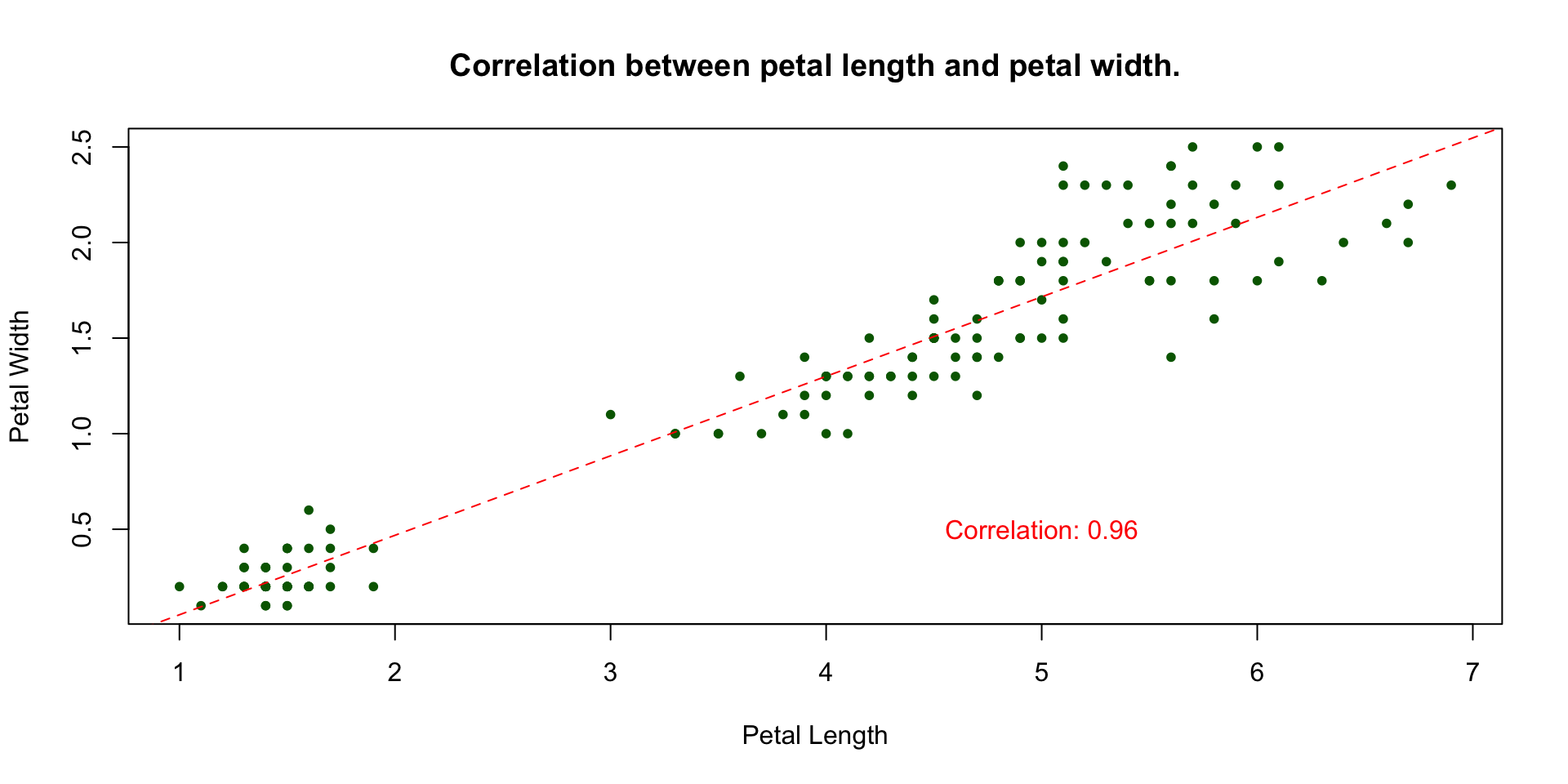
main="...";xlab="..." and ylab="...";pch=20 and dark green col="darkgreen".Line of Best Fit
We also might want to overlay a line of best fit using the linear model lm() function.
We will not cover the lm() function in this course, but in summary it fits a linear regression model between the x and y variables and we use this model to plot the line of best fit.
We add this line to our plot using the function abline().

Notice in lm() we used Rโs formula notation y ~ x. It is recommended to use formula notation for your plots as it makes your code clearer.
Key Syntax
y ~ x reads as โy modeled by xโ โ the response goes on the left of ~, predictors go on the right.data = ... argument lets you refer to columns by name directly, without repeating dataframe$ in front of every variable.+, e.g. y ~ x1 + x2.
Discretizing
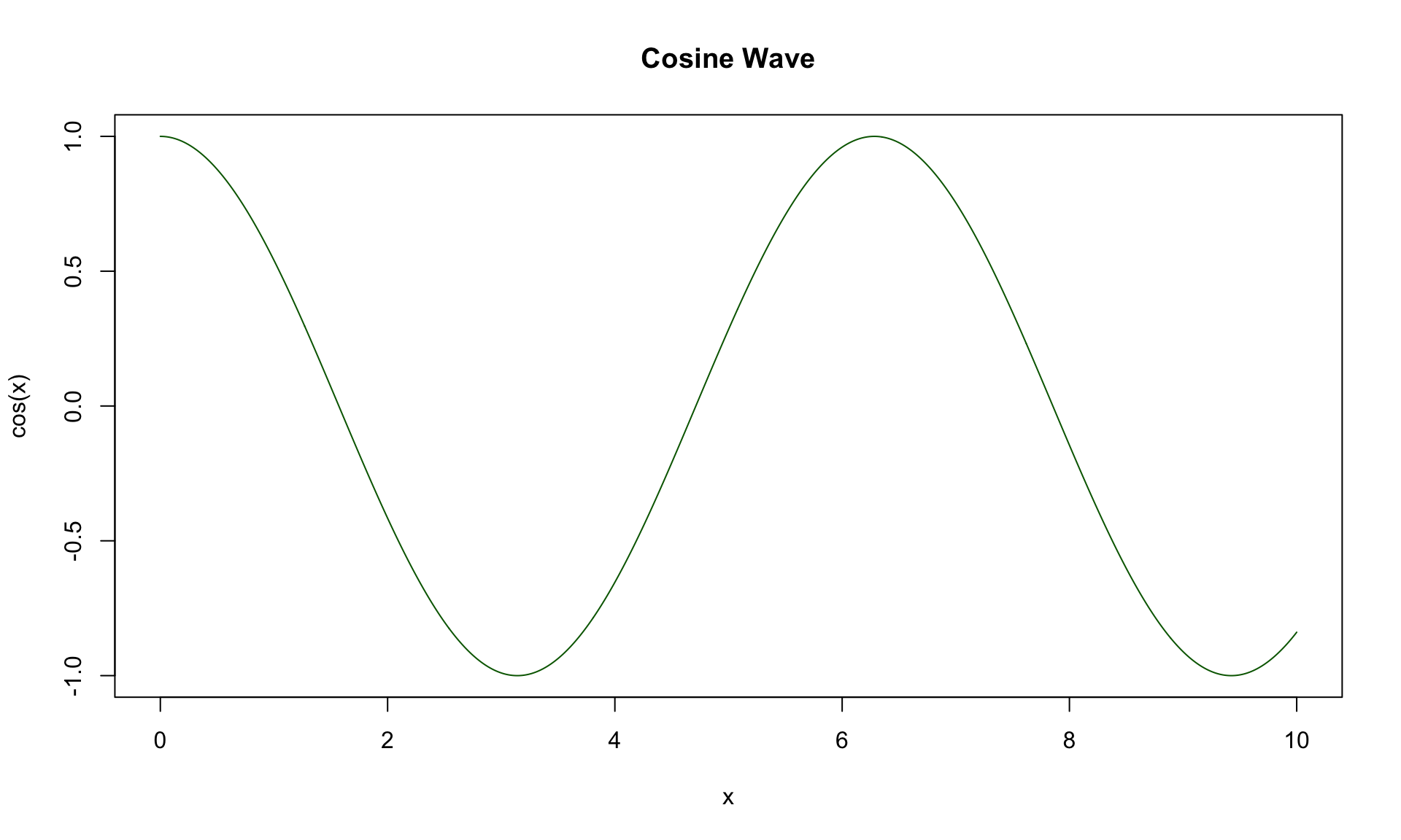
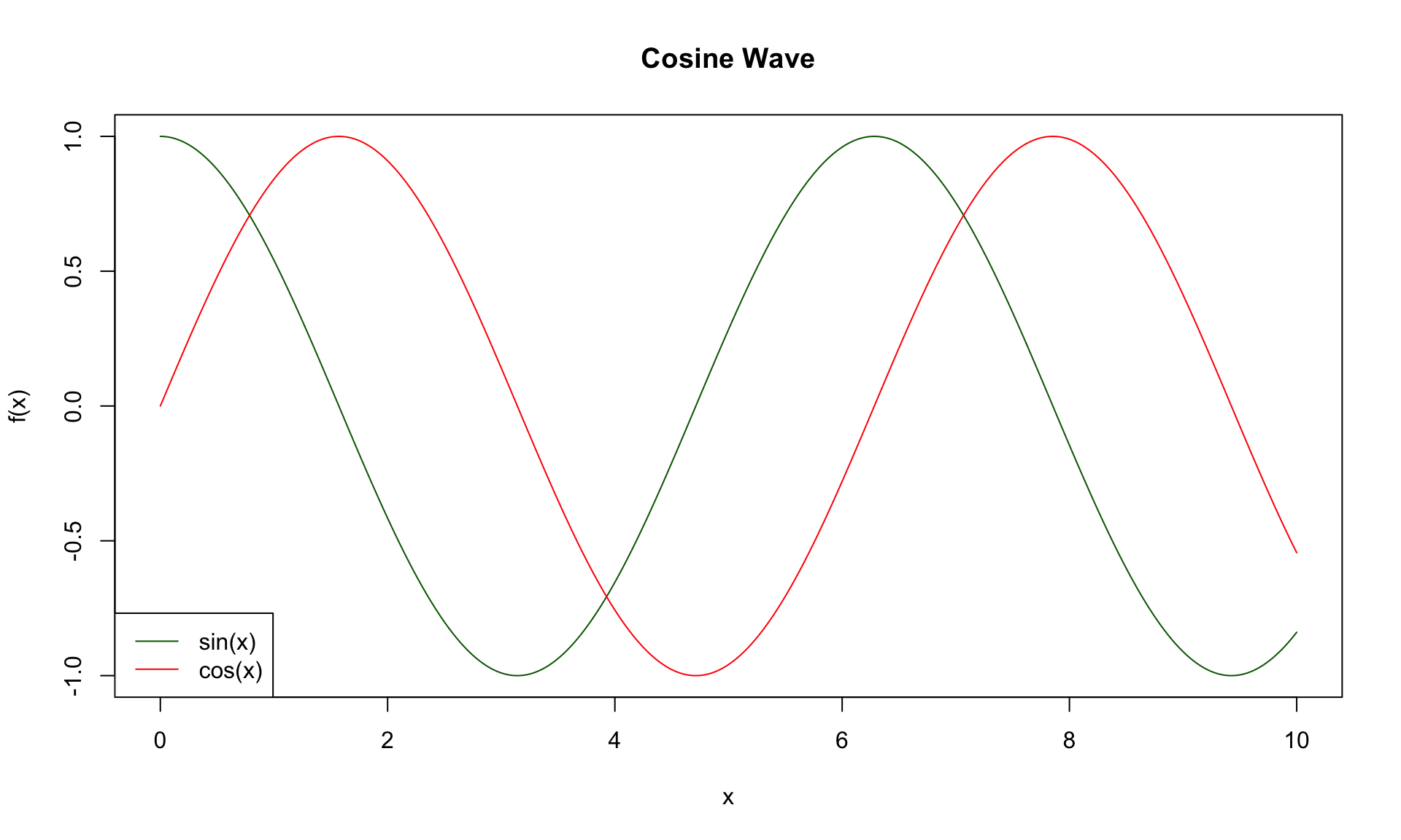
sin() or exp(), we discretize them โ redefining the interval as a sequence with very fine discrete jumps.Cosine Wave Example
cos(x) and specify type="l", which plots a smooth line between the points rather than the points themselves.
Using lines()
lines() function.lines() takes broadly the same arguments as plot() (e.g. col, type, lty).Adding a Legend
legend()."bottomleft") sets the position of the legend.legend = c(...) gives the labels for each line.col = ... and lty = ... should match the plotted lines so the legend correctly identifies each one.
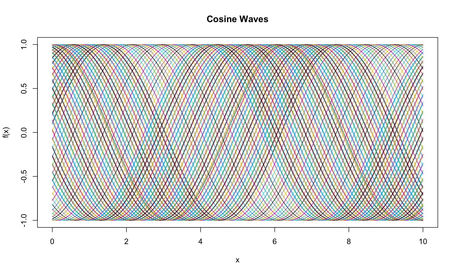
For a bit of fun we conclude by demonstrating how a for loop can be used to iteratively produce complicated plots:
i from 1 to 100.sin(x + i/10) using lines().col = i cycles through Rโs default color palette, giving each new line a different color.
05:00
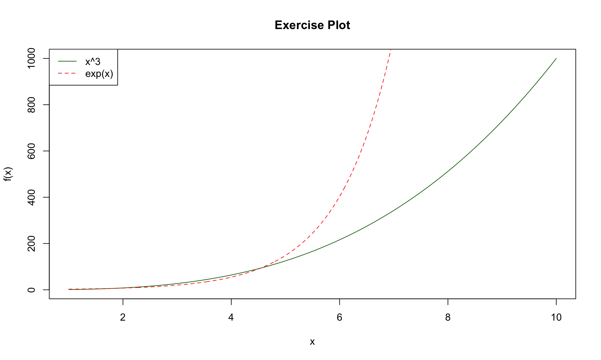
Produce plots for \(x^3\) and \(e^x\) for x between 1 and 10.
x as a discretized sequence of values.x_cubed as \(x^3\) and exp_x as \(e^x\).x against x_cubed, adjusting formatting as desired.x between 1 and 10, then define x_cubed as \(x^3\) and x_exp as \(e^x\).x against x_cubed as a line, then overlay x_exp using lines().# define variables
x <- seq(1, 10, by = 0.01)
x_cubed <- x^3
x_exp <- exp(x)
# produce plot
plot(
x, x_cubed,
main = "Exercise Plot",
xlab = "x", ylab = "f(x)",
type = "l", col = "darkgreen"
)
lines(x, x_exp, col = "red", lty = 2)
legend(
"topleft",
legend = c("x^3", "exp(x)"),
col = c("darkgreen", "red"), lty = 1:2
)
๐ค Today we looked into:
๐คฉ Next class we will temporarily leave behind data science topics as we study probability theory! The next four classes will be (roughly) split as follows: